
When Magnolia/STYL and Goldman Sachs took over a well-performing property known as The Alexan, a complete rebrand was legally required under 30 days — name, visual identity, signage, everything. But there was a twist: the brand was working — residents were happy, leasing was strong, and perception was positive.
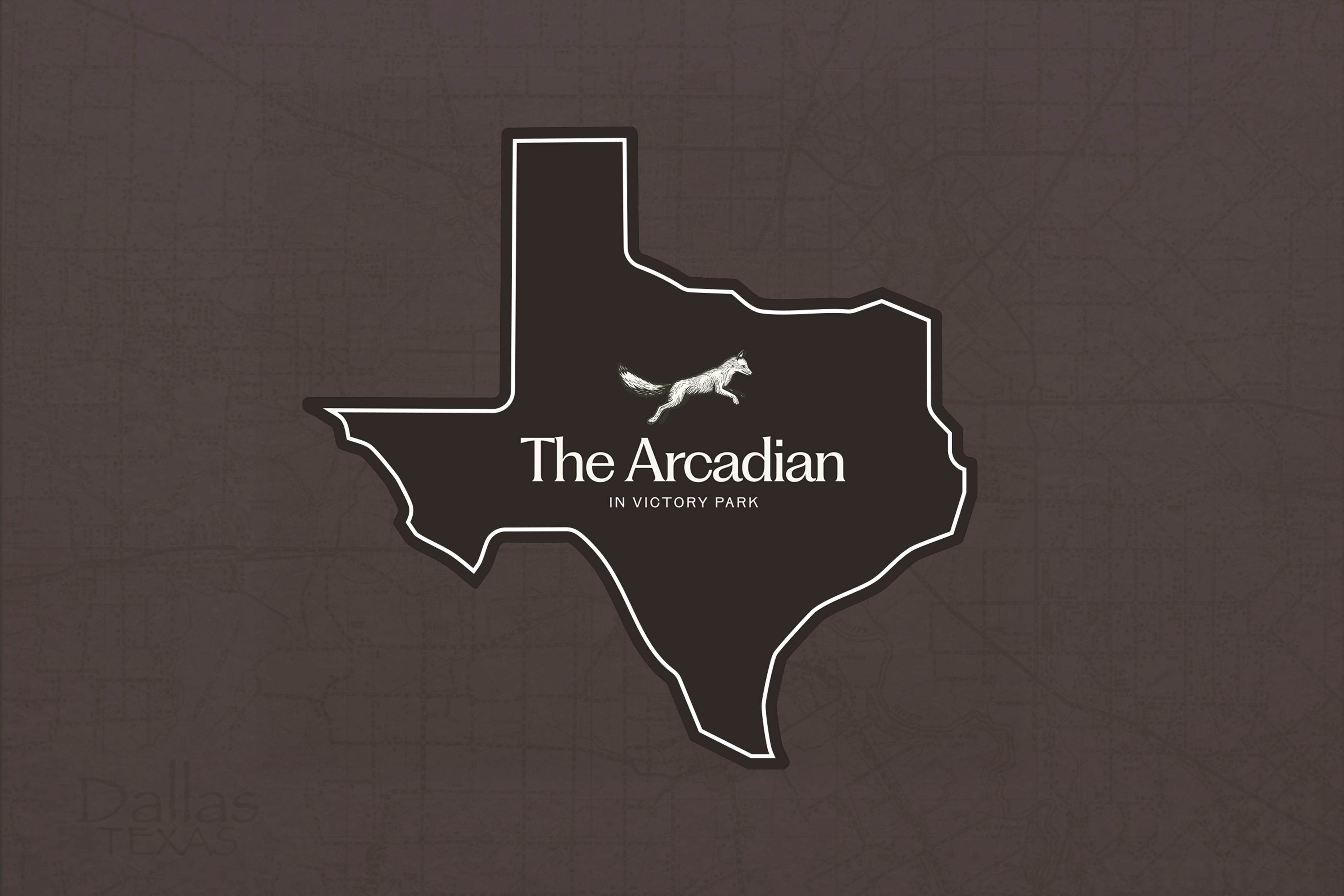
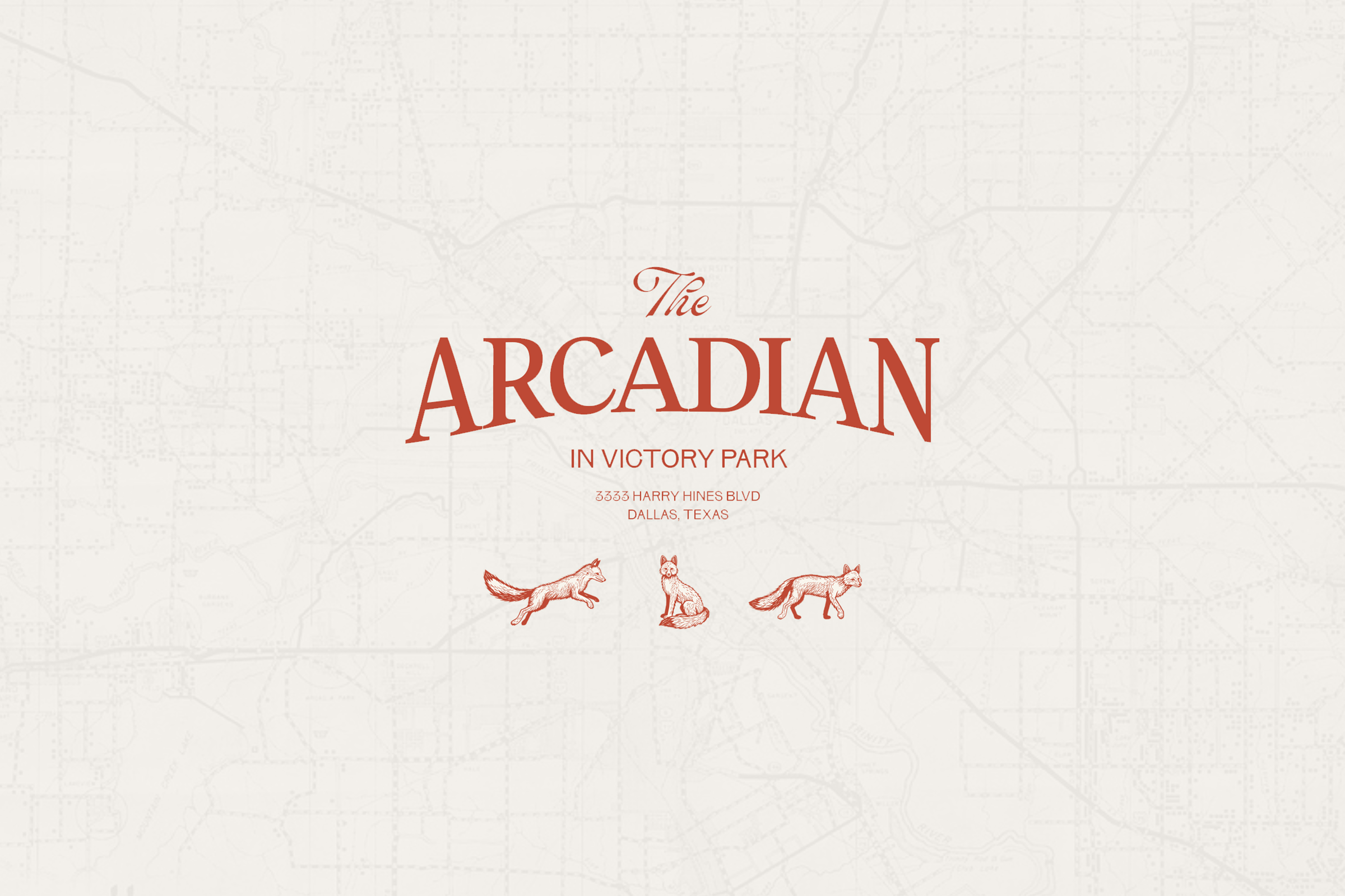
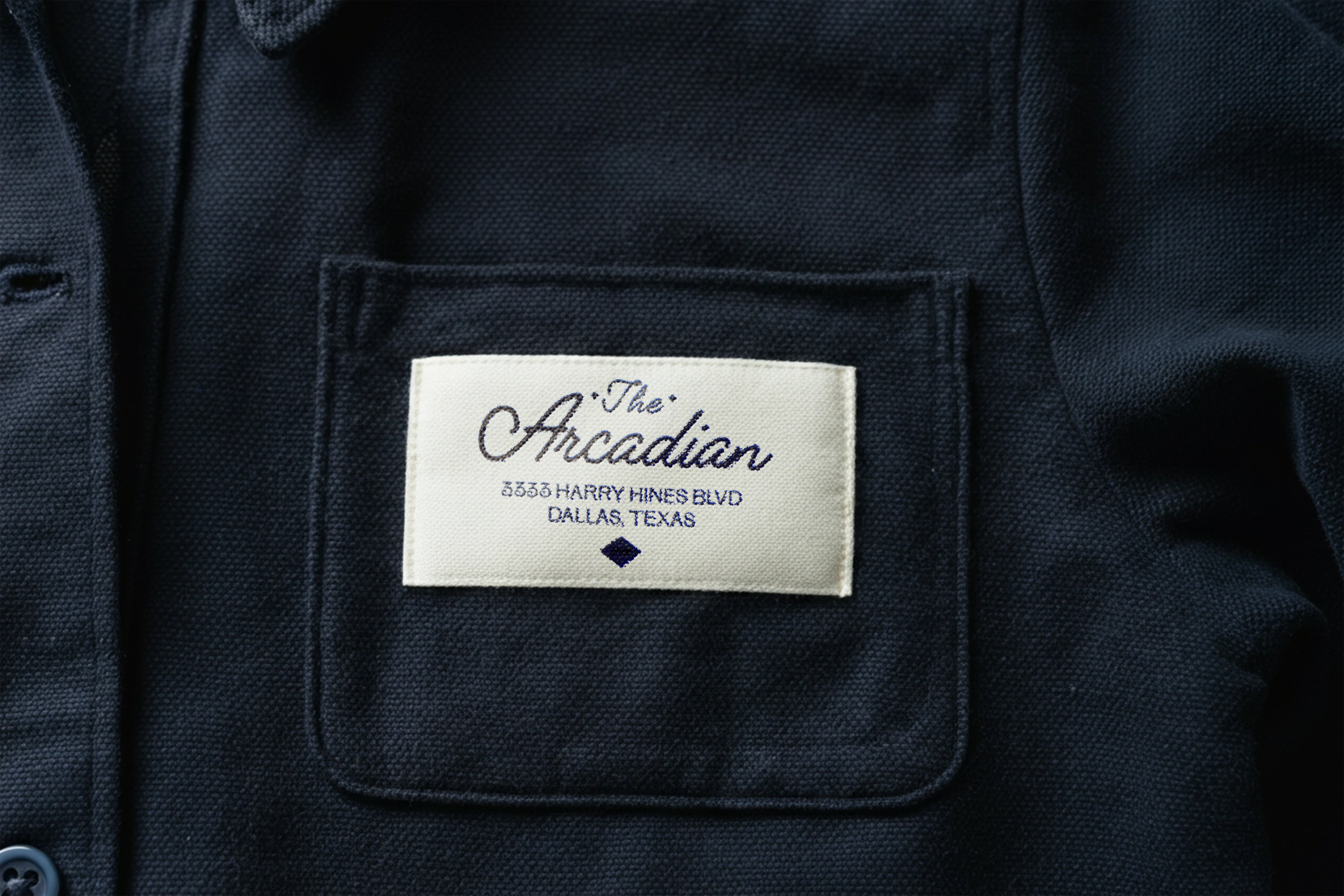
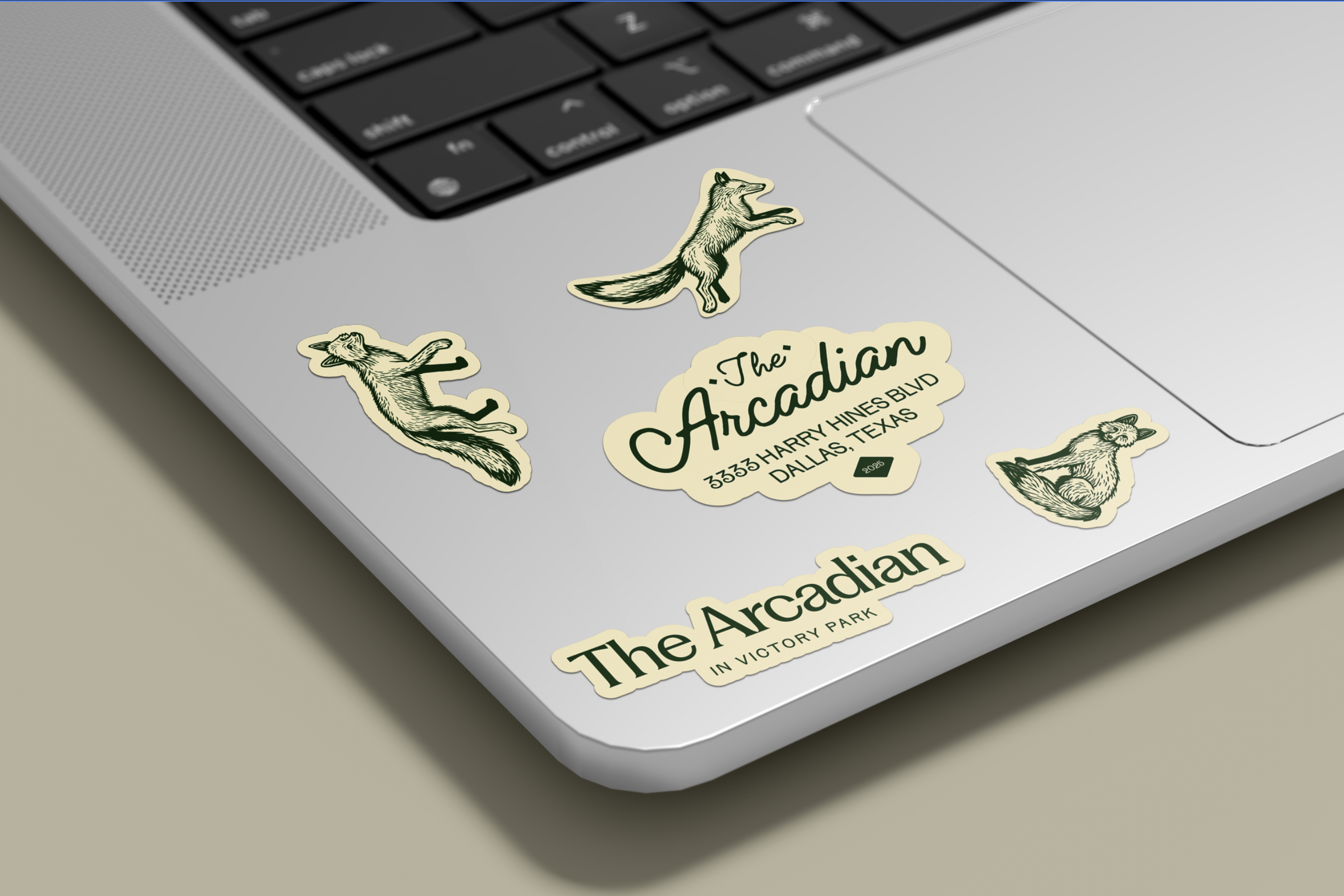
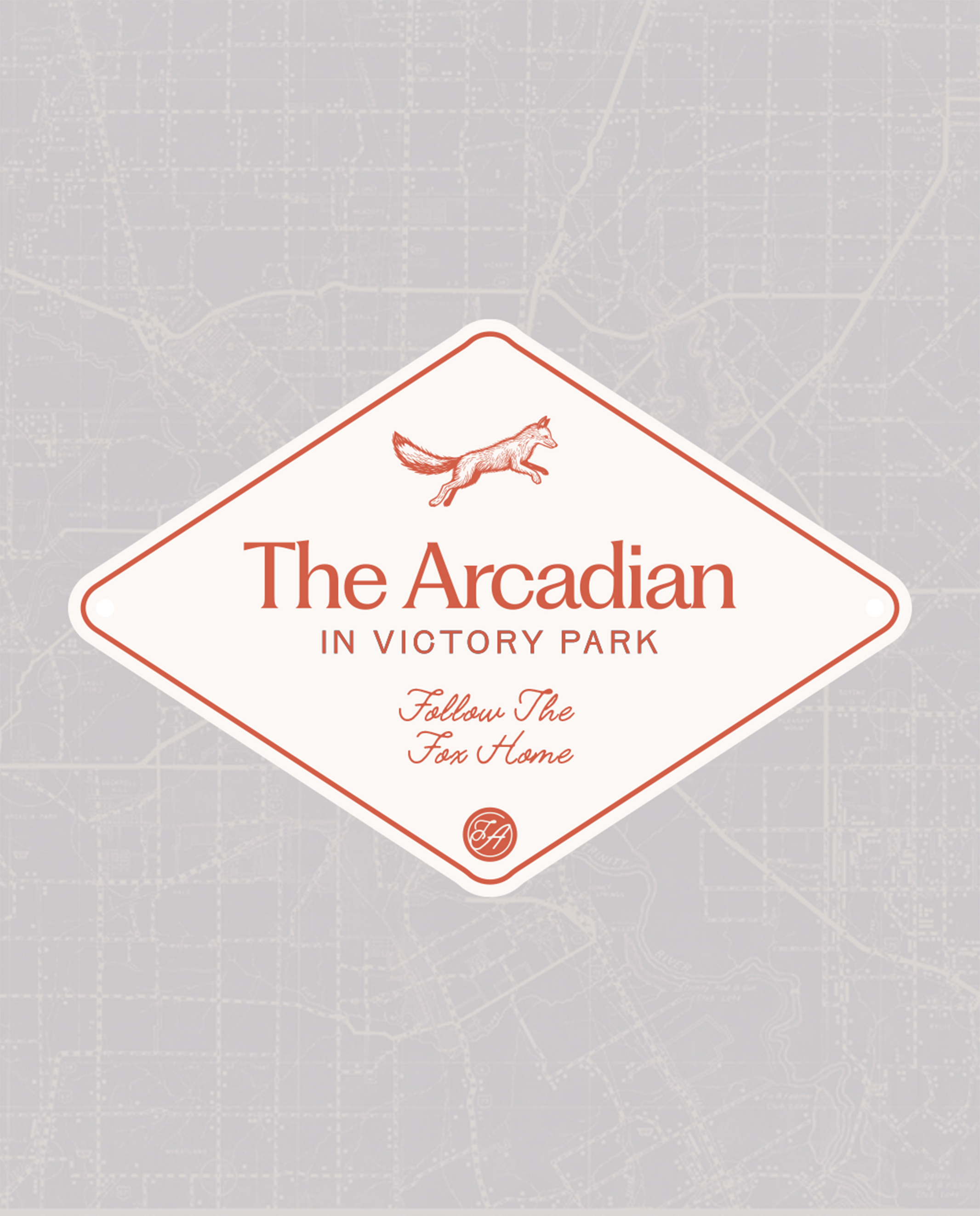
We created a full visual system for The Arcadian — a new name evoking nature, elegance, and timeless ease. The design system leaned into the idea of a modern social club: inspired by the likes of Ralph Lauren’s Chicago flagship and Soho House, but interpreted for a distinctly Texas urban audience.
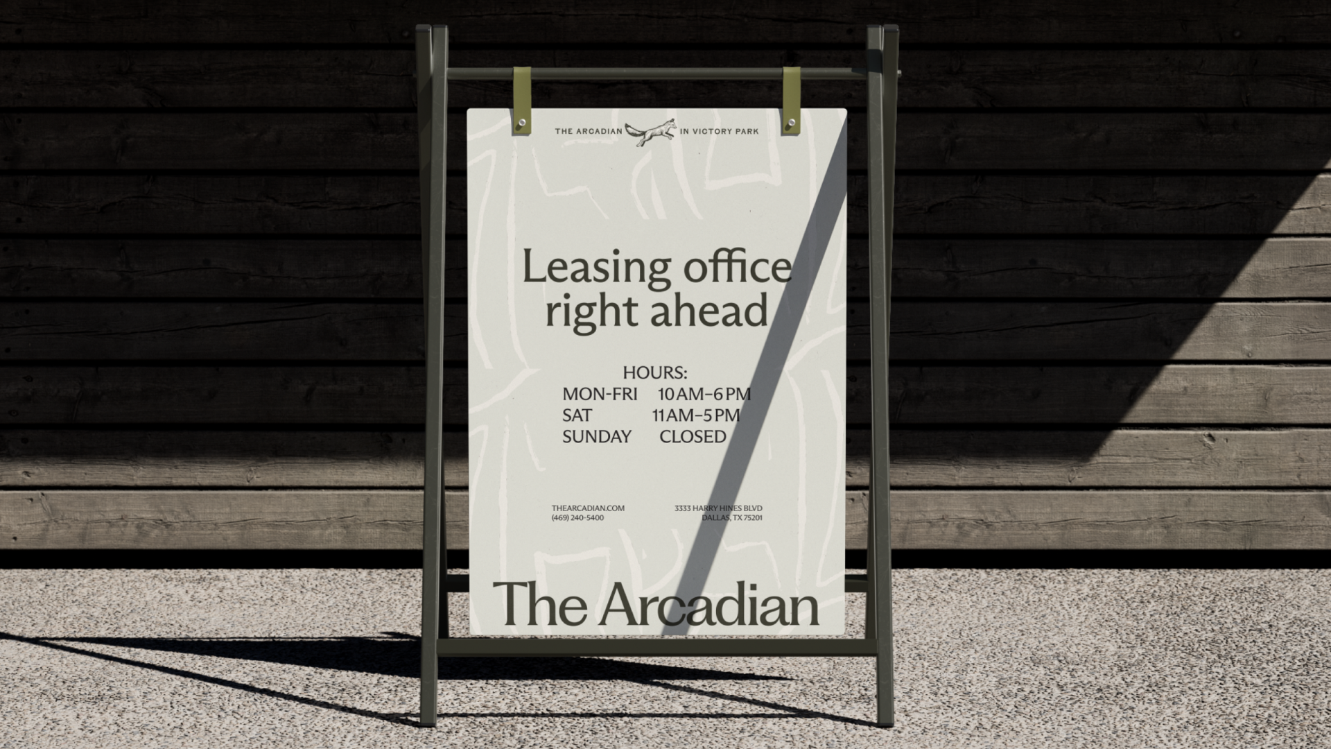
Signage was embedded across nearly 100 placements — from wayfinding to identity to monument sign — installed across a sprawling footprint, with special focus on maintaining site constraints, preserving existing structures, and subtly aligning with the nearby Katy Trail, a vibrant green space in downtown Dallas.
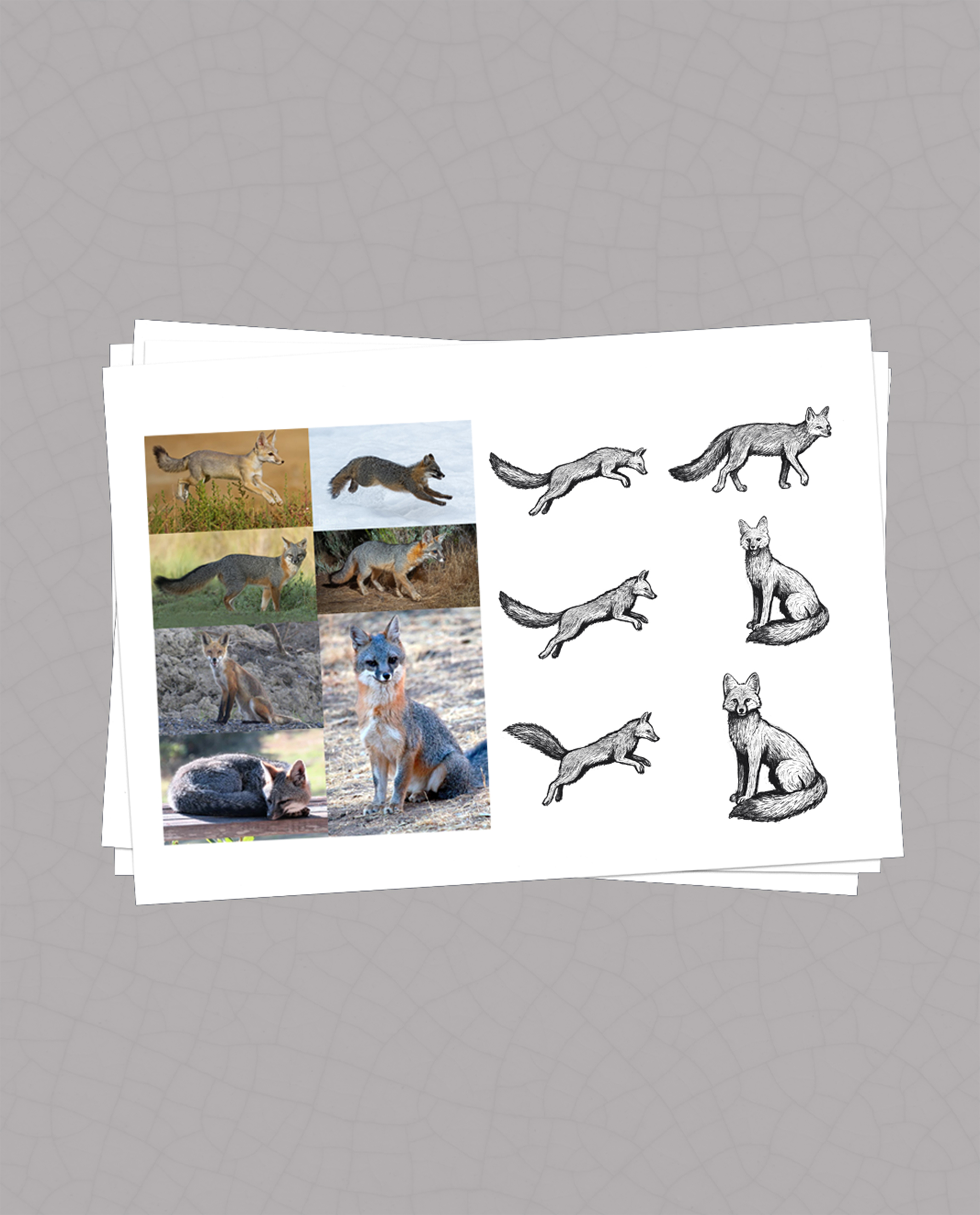
One idea that emerged (but didn’t make it to production): a series of bronze fox statues as a narrative marker, guiding pedestrians from the trail to the leasing office. The fox — native to the area — became a subtle mascot in spirit, if not in metal. The result is a cohesive, elevated brand system that speaks to place, people, and potential — all without breaking the trust of those already living there.
Following the acquisition of a well-performing property, the client was contractually obligated to remove the name, branding, and signage. And so under 30 days. The challenge? Rebrand an asset that was already doing well — without losing what made it successful. And doing it fast.
The new name — The Arcadian — emerged from our research and tested naming framework, inspired by timeless ideas of nature, escape, and elegance. The name feels calm, elegant, slightly storied — without being pretentious. Our goal was to create an identity that felt elevated yet familiar — modern and club-like, without leaning into clichés or feeling imported and avoiding tired “Western” tropes.
The Arcadian is a large, spread-out property with dozens of navigation and branding moments across the site. We developed a signage system that worked within existing structures and spatial limitations, while introducing clarity and consistency at scale. We also explored more expressive gestures — including sculptural narrative ideas tied to the nearby Katy Trail (not executed due to budget).

This was a project full of moving parts — from legal brand removal to tight budget considerations to new vendor relationships. We stayed deeply engaged with all partners, solving problems in real time and ensuring steady progress.
This project reinforced our belief that great branding lives in the details and relationships. Success wasn’t just the final design — it was how we got there: collaboratively, carefully, and with deep respect for the space and the people who inhabit it.
“MarkerHeads delivered quality work in record time. We knew we could count on them.”